At ChangeStar, we create Fundraising DM: Direct Marketing appeals for charities.
In this blog, we look at how good design techniques can transform the success of your fundraising DM appeal. We look inside the mind of a warm supporter, and acknowledge the initial negative thoughts that may pop up when they first glance at a charity appeal in their pile of post!
It’s crucial that we design a fundraising DM pack for your charity that convinces the donor to read on and then to give, rather than reject it to the recycling bin. All barriers to giving need to be removed.
A central factor in this is to ensure each appeal looks like (and genuinely is) a personal communication from one individual to another. Authenticity is key, and recipients aren’t fools – they can see a piece of inauthentic ‘advertising through the post’ from a mile off.
Here are some ChangeStar design strategies that can encourage donors to read on:
Reason to reject: “I’ve already given you money”
- If you usually place a headline or image on appeal envelopes, test a plain envelope. And vice versa!
- Create urgency through design. Use an urgent ‘stamp’.
- Think carefully about the enclosing order of the pack, and ensure an interesting, powerful item will be seen first.
- Show genuine need through emotive photography.
- Make the calls to action bold and prominent.
- Use a lift letter from someone outside the organisation to endorse the appeal.
- Use coloured paper for a lift letter, to make it stand out.
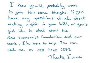
- Include real handwriting for annotations and letters, to make them more personal.
- Use a timeline to show supporters that their support matters not just in previous projects, but in future projects too. (Variable copy will also help – thanking donors for past support.)
Reason to reject: “I can’t afford to give much at all”
- Use graphs, infographics or shopping lists to emphasise that a small amount can go a long way.
Reason to reject: “I’m just a number. I don’t matter to the charity.”
- Unless your database is huge, try to avoid having barcodes on your letters. They look very impersonal. Ask your mailing house to match using a small numeric code instead, which will be less noticeable.
- Use supporter codes at a small, discrete size.
- Again, areas of handwriting can help make a mailing look more personal, and less corporate. At ChangeStar we often scan real handwriting, rather than use a handwriting font.
- Your main letter could come across as more personal if it is a straightforward letter with no images. It will look less like a ‘mailing’ made by a marketing team.
Reason to reject: “I don’t have time to read this”. And “My eyesight isn’t good.”
- Make text large – 12 to 13pt for a letter. This is particularly important if your audience is older – as many are in fundraising.
- Ensure the layout is easy to read throughout.
- Draw readers in with images that have impact.
- Use colour to differentiate sections, and emphasise your key messages. Don’t be afraid to repeat them.
- Use the handwriting we suggested above sparingly!
Reason to reject: “Sending this donation form back is such a pain”
- Have your donation form as a separate piece of paper, so donors don’t need to bother tearing it off.
- Lay out the information very carefully so the form is as easy to complete as possible. This takes great design skill to present lots of copy in a way that appears spacious!
- Include a Reply Envelope, so it’s easy to return.
- Include an option to give online or by phone, but this won’t typically attract many people. The postal donation form is still key!
Reason to reject: “I’m not convinced my money is being spent well”
- Use visuals to show facts about how and where money will be spent.
- Include a graph or pie chart to appeal to the head as well as the heart.
- Find a balance between creating an interesting, engaging appeal pack, and one that looks wasteful and over-the-top. Consider the paper stock and weight of each item.
This blog explores just one aspect of creating successful fundraising appeals – the design. See our work here. At ChangeStar we are also experts in fundraising copywriting, Individual Giving strategy, donor and member recruitment and fundraising via digital channels.
Here are further tips from ChangeStar on generating fantastic results from your fundraising DM appeals:
How to create a target-smashing Christmas appeal
How to convert cash donors to Direct Debit
How to find good case studies for fundraising
How to increase your legacy income by 800%
If you’re looking for a fundraising agency to create your Direct Marketing appeals, contact ChangeStar for a chat! Call us on 01273 964018 or email Richard Docwra, ChangeStar Director, on richard@changestar.co.uk


